Overview of datacube and quicklooks
Contents
Overview of datacube and quicklooks#
This notebook shows a few examples for how to access the datacube.
Environment setup#
import os
import pooch
import pandas as pd
import numpy as np
import xarray as xr
import dask as da
from dask.diagnostics import ProgressBar
import zarr
import holoviews as hv
import hvplot.xarray
import matplotlib.pyplot as plt
from chaosmagpy.plot_utils import nio_colormap
from src.env import ICOS_FILE, REFRAD
TMPDIR = os.getcwd()
zarr_store = os.path.join(TMPDIR, "datacube_test.zarr")
print("Using:", zarr_store)
xr.set_options(
display_expand_attrs=False,
display_expand_data_vars=True
);
Using: /home/ash/code/geomagnetic_datacubes_dev/notebooks/datacube_test.zarr
Data can be opened easily with xarray (but could be done more directly with zarr):
ds = xr.open_dataset(zarr_store, engine="zarr")
ds
<xarray.Dataset>
Dimensions: (Timestamp: 15468403, NEC: 3)
Coordinates:
* NEC (NEC) object 'N' 'E' 'C'
* Timestamp (Timestamp) datetime64[ns] 2014-05-01 ... 201...
Data variables: (12/26)
B_NEC (Timestamp, NEC) float64 ...
B_NEC_CHAOS-MCO (Timestamp, NEC) float64 ...
B_NEC_CHAOS-MMA (Timestamp, NEC) float64 ...
B_NEC_CHAOS-Static_n16plus (Timestamp, NEC) float64 ...
B_NEC_MCO_SHA_2C (Timestamp, NEC) float64 ...
B_NEC_MIO_SHA_2C (Timestamp, NEC) float64 ...
... ...
RC (Timestamp) float64 ...
Radius (Timestamp) float64 ...
SunZenithAngle (Timestamp) float64 ...
dRC (Timestamp) float64 ...
gridpoint_geo (Timestamp) int64 ...
gridpoint_qdmlt (Timestamp) int64 ...
Attributes: (2)Above we show the html representation from xarray. Click the buttons at the right to see the metadata and variable contents. Lean more about xarray at https://foundations.projectpythia.org
Numpy arrays can be extracted with calls like:
ds["B_NEC"].data
array([[25404.6361, 4025.1622, 5844.2084],
[25512.0942, 4057.305 , 5283.5619],
[25615.9567, 4089.554 , 4718.7032],
...,
[30533.0217, -350.5871, 9981.4647],
[30453.7695, -289.8218, 10799.6484],
[30363.1594, -230.3686, 11613.4581]])
Diagnostics of data#
Assuming input 1Hz data, this is how much the data has been decimated by
(i.e. it is 10s sampling, with a bit more lost due to quality Flags)
timedelta_ns = float(ds["Timestamp"].isel(Timestamp=-1) - ds["Timestamp"].isel(Timestamp=0))
print("Fraction of input data:", len(ds["Timestamp"]) / (timedelta_ns/1e9))
Fraction of input data: 0.09804625053536435
Spatial variation of magnetic field data, and data-model residuals#
Do some tricks to generate manageable summary images…
First downsample again so we don’t needlessly work with all the data just for these visualisations:
# Dataset downsampled by 1/30 (i.e. 5-minute sampling)
_ds = ds.isel(Timestamp=slice(0, -1, 30))
# Generate residuals to plot
_ds["B_NEC_res_CHAOS-full"] = (
_ds["B_NEC"]
- _ds["B_NEC_CHAOS-MCO"]
- _ds["B_NEC_CHAOS-MMA"]
- _ds["B_NEC_CHAOS-Static_n16plus"]
)
These next plots use hvplot (using holoviews) underneath to generate interactive bokeh plots - this is quite tricky to work with so better left alone until you have mastered matplotlib.
def plot_NEC_var(_ds=_ds, var="B_NEC", qdmlt=False, **kwargs):
if qdmlt:
x, y = "MLT", "QDLat"
else:
x, y = "Longitude", "Latitude"
return (
_ds.drop("Timestamp")
.hvplot.scatter(
x=x, y=y, c=var,
by="NEC", subplots=True,
rasterize=True,
colorbar=True,
hover=True,
width=300, height=200,
**kwargs
)
)
print("B_NEC: magnetic field measurements")
plot_NEC_var(_ds=_ds, var="B_NEC", clim=(-50000, 50000), cmap=nio_colormap())
B_NEC: magnetic field measurements
print("B_NEC_res_CHAOS-full: The effect of removing the full CHAOS model, comprising core, magnetosphere, and lithosphere. i.e. mostly space weather signals remaining")
plot_NEC_var(_ds, "B_NEC_res_CHAOS-full", clim=(-50, 50), cmap=nio_colormap())
B_NEC_res_CHAOS-full: The effect of removing the full CHAOS model, comprising core, magnetosphere, and lithosphere. i.e. mostly space weather signals remaining
print("As above, but in QDLat / MLT coordinates")
plot_NEC_var(_ds, "B_NEC_res_CHAOS-full", qdmlt=True, clim=(-50, 50), cmap=nio_colormap())
As above, but in QDLat / MLT coordinates
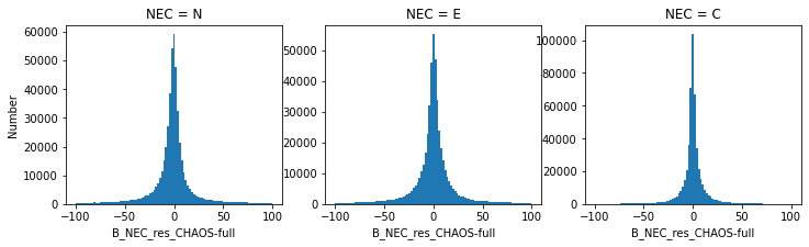
Histograms of residuals#
fig, axes = plt.subplots(ncols=3, figsize=(12, 3))
bins = np.linspace(-100, 100, 100)
_ds["B_NEC_res_CHAOS-full"].sel(NEC="N").plot.hist(bins=bins, ax=axes[0]);
_ds["B_NEC_res_CHAOS-full"].sel(NEC="E").plot.hist(bins=bins, ax=axes[1]);
_ds["B_NEC_res_CHAOS-full"].sel(NEC="C").plot.hist(bins=bins, ax=axes[2]);
axes[0].set_ylabel("Number");
Spread of residuals, under different data selections#
# Masks to use for data subselection
# There are still a few outliers remaining in the data
# -detect where the residual is anomalously large:
outliers = np.fabs((_ds["B_NEC_res_CHAOS-full"]**2).sum(axis=1)) > 2000**2
nightside = ~outliers & (_ds["SunZenithAngle"] > 100)
nightside_quiet = nightside & (_ds["Kp"] < 3)
nightside_quiet_low_MEF = nightside_quiet & (_ds["IMF_Em"] < 0.8)
def _plot_stdvs(_ds, ax, title):
(
_ds
.groupby_bins("QDLat", 90)
.std()["B_NEC_res_CHAOS-full"]
.plot.line(x="QDLat_bins", ax=ax)
)
ax.set_title(title)
ax.set_ylabel("")
fig, axes = plt.subplots(ncols=4, figsize=(20, 5), sharey=True, sharex=True)
_plot_stdvs(_ds.where(~outliers), axes[0], "Without data selection")
_plot_stdvs(_ds.where(nightside), axes[1], "Night")
_plot_stdvs(_ds.where(nightside_quiet), axes[2], "Night; Kp<3")
_plot_stdvs(_ds.where(nightside_quiet_low_MEF), axes[3], "Night; Kp<3; $E_m$<0.8")
axes[0].set_ylim((0, 150))
axes[0].set_ylabel("B_NEC_res, standard deviations [nT]");
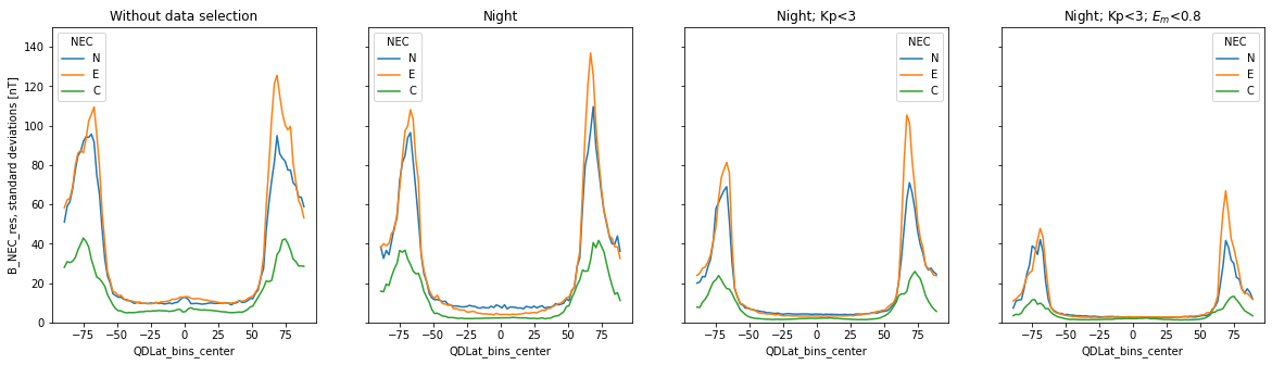
Above: the spread of residuals found under increasingly stringent data selection; i.e. why we typically use geomagnetically quiet nightside data for internal field modelling. For a deeper dive on this, see https://swarm.magneticearth.org/notebooks/04a1_geomag-models-vires
Begin exploring relationships between parameters…#
north_auroral_oval = (_ds["QDLat"] > 60) & (_ds["QDLat"] < 80)
(
_ds.where(north_auroral_oval & ~outliers, drop=True)
.drop("Timestamp")
.sel(NEC="C")
.plot.scatter(
x="IMF_Em", y="B_NEC_res_CHAOS-full", s=1
)
)
<matplotlib.collections.PathCollection at 0x7f8ff49f8670>
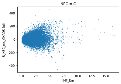
It is possible to find correlations between the residuals and solar wind parameters such as merging electric field (IMF_Em in the datacube; sometimes referred to as \(E_m\)). This needs to be explored also as a function of position within QDLat / MLT. See Figure 8.1 (page 135) in my thesis (https://doi.org/10.5281/zenodo.3952719)
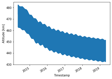
Temporal information#
_ds["Altitude"] = (_ds["Radius"] - REFRAD)/1e3
_ds["Altitude"].attrs = {"units": "km"}
_ds["Altitude"].plot.line(x="Timestamp");